
.svg)
How to design a masonry grid in Webflow
.svg)
In the world of web design, masonry grids have become increasingly popular for their unique style and versatility. Creating a visually appealing and functional masonry grid may seem daunting at first, but with the help of Webflow, it becomes a breeze. In this article, we will delve into the basics of masonry grids, explore the benefits of using them in web design, and guide you through the process of designing your very own masonry grid in Webflow.
Understanding the Basics of Masonry Grid
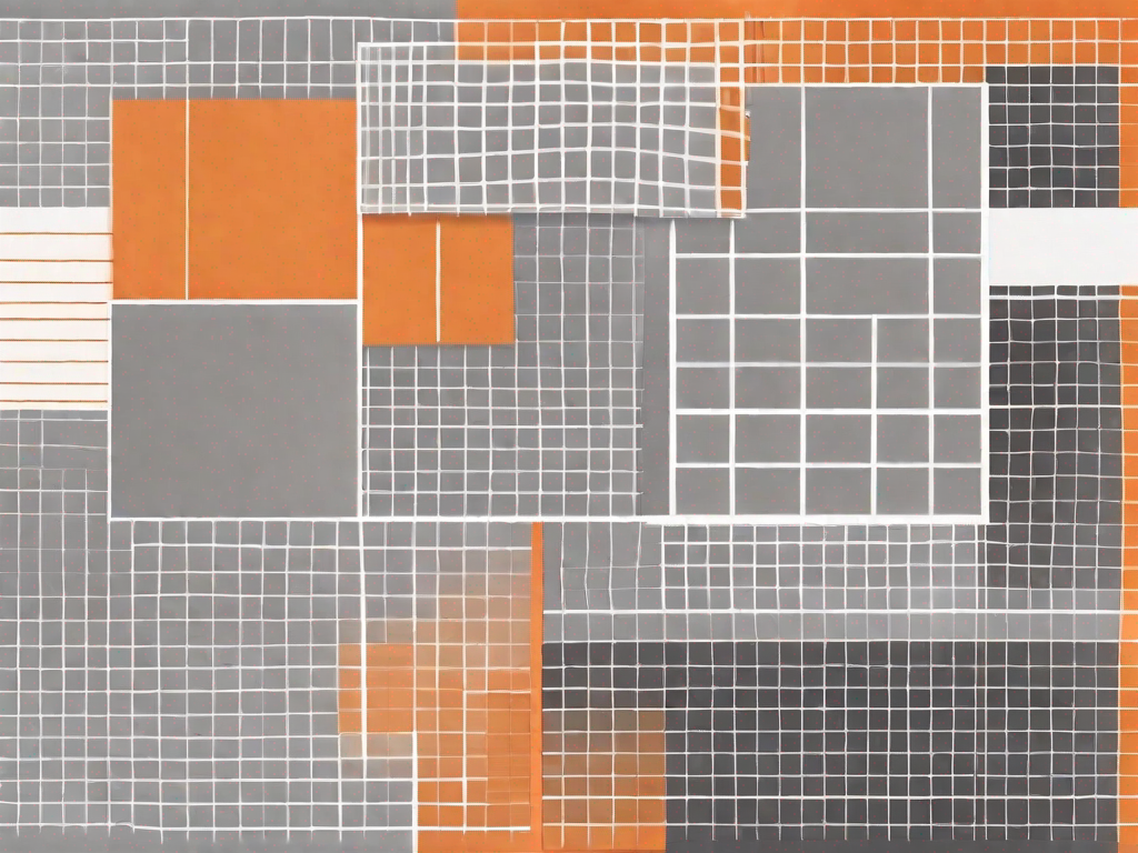
Before we dive into the intricacies of designing a masonry grid in Webflow, let's start with the fundamentals. So, what exactly is a masonry grid? Well, unlike traditional grid systems, a masonry grid organizes content in a way that allows for varying heights and widths of elements. This results in a more dynamic and visually interesting layout.
Each element in a masonry grid fits into the available vertical space, creating a seamless and fluid design. This adaptability makes masonry grids a great choice for displaying diverse types of content, such as images, text, or a combination of both.
But let's delve deeper into the concept of a masonry grid. Imagine a wall made of bricks, each brick being a different size and shape. Now, instead of arranging these bricks in a neat and uniform pattern, we stack them together in a way that creates an aesthetically pleasing and unique design. This is essentially what a masonry grid does for your web design - it breaks away from the rigid structure of traditional grids and allows for a more creative and visually appealing layout.
What is a Masonry Grid?
A masonry grid is a layout system that arranges content in a brick or grid-like pattern. Unlike traditional grid layouts, masonry grids allow for elements of different sizes and heights to fit together perfectly, creating an aesthetically pleasing and unique design.
Imagine you have a collection of images, each with its own dimensions and aspect ratio. With a traditional grid layout, you would have to resize and crop these images to fit into a uniform grid. However, with a masonry grid, you can let each image retain its original size and shape, resulting in a visually captivating arrangement.
Think of it as a puzzle where each piece has its own unique shape, and when you put them all together, they form a beautiful picture. This flexibility in sizing and arrangement is what sets masonry grids apart from their traditional counterparts.
Why Use a Masonry Grid in Web Design?
Using a masonry grid in web design offers numerous benefits. Firstly, it adds a touch of creativity and visual interest to your website. By breaking away from the rigid structure of traditional grids, masonry grids allow for more layout possibilities.
Imagine you have a blog with different types of content - articles, images, and videos. With a masonry grid, you can create a visually engaging homepage where each piece of content is displayed in a unique and captivating way. The varying sizes and heights of the grid elements prevent monotony and create a sense of excitement and discovery for your users.
Furthermore, masonry grids are particularly effective when showcasing visual content, such as photography portfolios or product galleries. The varying sizes of the grid elements prevent monotony, creating a captivating and engaging user experience. Users can explore your visual content in a non-linear and visually stimulating manner, enhancing their overall browsing experience.
So, whether you want to add a touch of creativity to your website or showcase your visual content in an engaging way, a masonry grid is a fantastic choice for web design.
Getting Started with Webflow
Now that we have a good understanding of masonry grids, it's time to acquaint ourselves with Webflow. Webflow is a powerful web design tool that empowers you to create stunning websites without coding knowledge.
An Introduction to Webflow
Webflow is a web design platform that combines the intuitive visual interface of a drag-and-drop builder with the flexibility and control of a code editor. It provides a comprehensive set of features that can help you bring your masonry grid design to life.
Setting Up Your Webflow Account
Before you can start designing your masonry grid, you'll need to set up your Webflow account. Simply head to the Webflow website and follow the straightforward sign-up process. Once you're all set up, it's time to dive into the exciting world of masonry grid design!
Designing Your First Masonry Grid in Webflow
Now that you have a solid foundation, it's time to put your newfound knowledge into practice by designing your very first masonry grid in Webflow. Remember, the key is to create a layout that is both visually appealing and functional.
Choosing the Right Layout for Your Grid
The first step in designing a masonry grid is selecting the most suitable layout for your needs. Webflow offers a variety of pre-built templates and layout options to help you get started quickly. Consider factors such as the type of content you'll be displaying and the overall theme of your website.
When choosing a layout, pay attention to how the elements will fit together and create a harmonious composition. Experiment with different configurations until you find the one that best showcases your content.
Adding and Organising Content in Your Grid
Once you've settled on a layout, it's time to bring your masonry grid to life by adding and organizing your content. Begin by uploading and placing your images or text elements in a visually pleasing manner.
While adding content, remember to maintain a balance between the sizes and heights of the elements. Aim for a harmonious distribution of content that keeps the viewer engaged and captivated.
Customizing Your Masonry Grid
Designing a masonry grid isn't just about arranging content; it's also about creating a visually striking design that aligns with your brand and overall website aesthetic. Webflow offers a range of customization options to help you achieve just that.
Adjusting Grid Size and Spacing
One of the key aspects of customizing your masonry grid is adjusting the grid size and spacing. By fine-tuning these parameters, you can create a layout that perfectly complements your content and enhances the overall visual appeal.
Experiment with different grid sizes and spacing options to find the perfect balance between elements. Remember to consider the user experience, ensuring that your masonry grid is both visually stunning and easy to navigate.
Applying Colours and Styles to Your Grid
To truly make your masonry grid stand out, you'll need to add your unique touch by applying colours and styles. Webflow allows you to choose from a vast range of color palettes and typography options to suit your brand identity and design vision.
Experiment with different colour schemes and typography styles to find the perfect combination that enhances the impact of your content and grabs the viewer's attention. Remember to maintain consistency throughout your design to create a cohesive and professional appearance.
Advanced Techniques for Masonry Grids in Webflow
Once you've mastered the basics and customized your masonry grid to perfection, it's time to take your design to the next level. Webflow provides advanced techniques that will elevate your masonry grid and make it even more captivating and responsive.
Responsive Design for Your Masonry Grid
In today's digital world, it's crucial to ensure that your masonry grid looks great on all devices. Webflow allows you to create responsive designs that adapt seamlessly to different screen sizes, guaranteeing an optimal user experience for everyone.
Experiment with breakpoints and layouts specific to different devices, such as mobile phones and tablets. Test your design thoroughly to ensure that the masonry grid responds beautifully and maintains its visual appeal across all screen sizes.
Adding Interactivity to Your Grid
While masonry grids are visually striking on their own, adding interactive elements can take the user experience to a whole new level. With Webflow's powerful interactions features, you can make your masonry grid come alive.
Consider incorporating interactive elements such as image zoom or hover effects to engage and captivate your audience. These subtle details can make a significant impact on how viewers interact with your grid and retain their interest.
With these advanced techniques, you can create a truly immersive and engaging masonry grid that dazzles and delights your website visitors.
Designing a masonry grid in Webflow opens up a world of possibilities for creating visually stunning and dynamic websites. By understanding the basics, harnessing the power of Webflow, and applying your unique touch, you can design masonry grids that leave a lasting impression on your audience.
So, what are you waiting for? Dive into the world of masonry grid design in Webflow today and unlock the full potential of your web design skills!
Related Posts


Let's
Let’s discuss how we can bring reinvigorated value and purpose to your brand.
.svg)