
.svg)
Make Your Business Story Part of Your Brand
.svg)

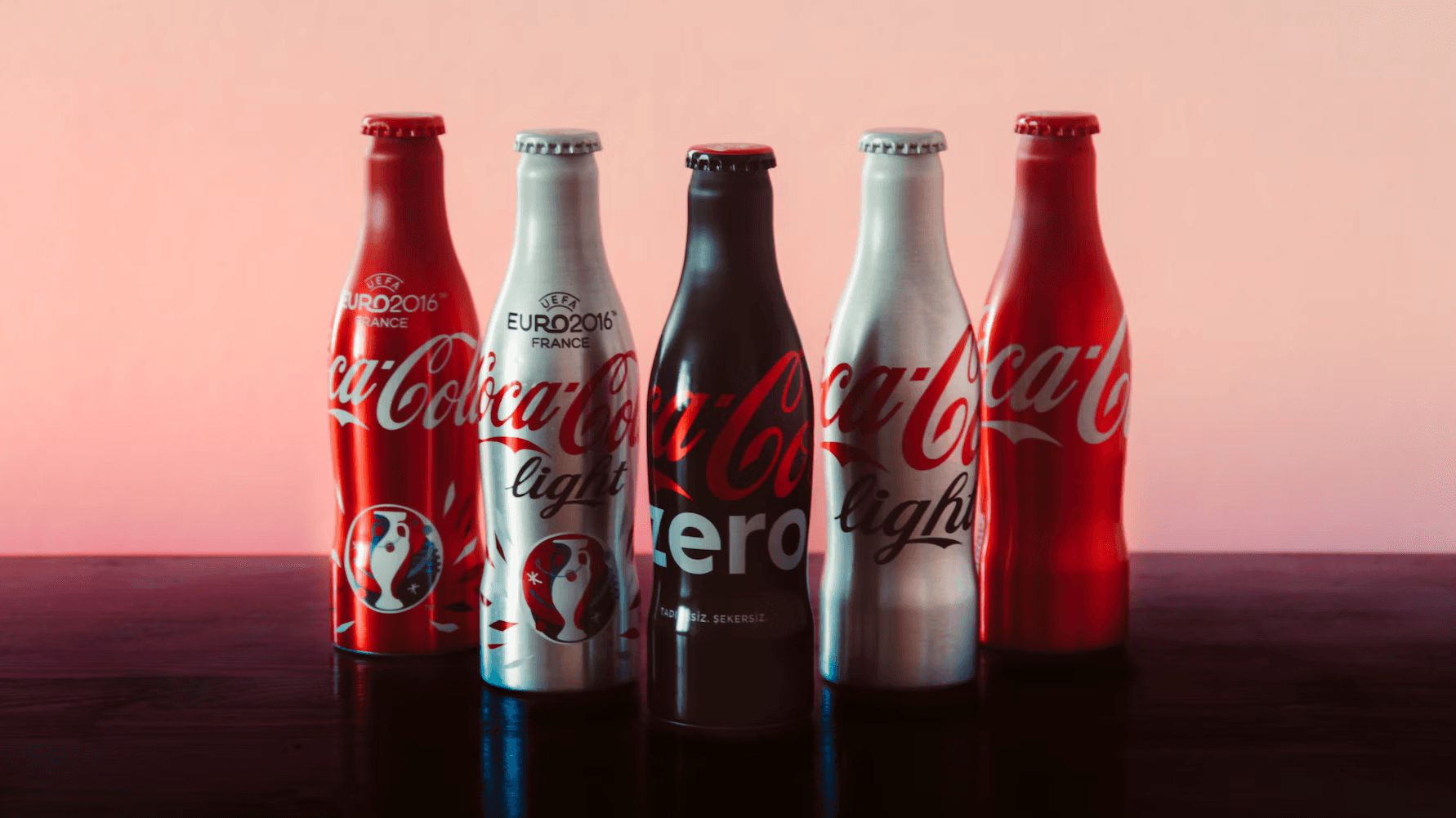
Brand identity is incomplete without colour. In reality, it is almost useless without the right choice of colour. In today’s world of fragmented media and fragmented attention, the use of the right colour (and an associated palette) has become critical for a brand to get right.Coke’s recent experiments with colour (to forge a stronger masterbrand endorsement) is an example of how to ‘get it wrong’ and ‘do it wrong’. Consider the following images that visualise Coke’s colour journey across its portfolio:
Coke’s colour architecture for its portfolio has moved from ‘individual colour palettes for each sub-brand’ to ‘masterbrand (red) driven uniform colour palette with variations’ and then currently to a ‘completely new colour palette for a sub-brand in one region of the world’. In all honesty, it has become difficult to distinguish a Cherry Coke (I hate) bottle from a standard Coke (I love) bottle.
My intention here is not to write a thesis on the use of colour as a mode of commercial symbolism and its deeper intent, but more a set of observations on how colour can be effectively used by brands to stand out, be distinctive, develop long-term memories and be able to get into the final consideration set in fragmented shopping environments.
More than 300 varieties of Nestle’s Kit Kat chocolate is sold in Japan (with limited editions adding to that number every year). Outside Japan, a Kit Kat chocolate’s colour identifier is red. In Japan, it is not red, but the consistent colour palette used for the logo that is the strongest distinctive asset. Coupled with the luck of closely resembling ‘kito kato’ (meaning ‘surely to win’) in Japanese, the consistent use of a colour palette for the logo has allowed the brand to stand out in crowded supermarket shelves.
Unlike Coke, disciplined use of a colour palette can also act as a navigation guide for a consumer through a brand’s portfolio. Consider how Ben & Jerry’s alters the use of the ‘blue’ in its tubs as a guide through the brand’s architecture — the visibility of the ‘blue sky’ alters as a consumer navigates through ‘ice cream tubs’ to ‘topped’ to ‘non-dairy’:
To exponentially strengthen distinctiveness in crowded marketplaces, brands need to use colour as a packaging differentiator rather than as a background. A really strategic and impactful way of using colour is one when consumers can identify a brand simply through its ‘colour signature’ (and nothing else).The new and expanded Nivea range of products continues to use the classic Nivea logo (white font lettering with a dark blue background) against different shades of blue packaging. The background colour of packaging continues to be blue, with ‘white’ used as a differentiator for products that are for ‘extra’, ‘special’ or ‘time dependent’ care or fall outside the core moisturising range. A knowledgeable consumer, should be able to navigate the whole Nivea portfolio by using ‘blue’ as a guide.
consider the use of colour to demarcate flavours of potato crisps. It is very confusing, when it comes to colour acting as a guide to choose between ‘flavours’ or between ‘healthier’, ‘low fat’ and adjacent formats. Considering the fact that crisps is a repertoire category with multiple brands vying for share of multiple occasions, a consumer is provided with an array of confusing choices. While navigating the category, a consumer is either using colour to identify a flavour within a brand, or specifically looking for the brand (zeroing in on the brand’s logo). The following examples bring alive this confusion in the UK:
Let’s move from a fragmented category (in terms of colour) and look at a brand that has more uniform colour usage. If we look at breakfast food items, belVita has consistently used the colour ‘yellow’ (symbolising the rising sun) across its product portfolio. Yellow is belVita and belVita is yellow. But beyond the yellow and the classic ‘flow’ behind the V, a colour is not a useful navigation guide within the belVita portfolio. In a crowded breakfast aisle in a supermarket, the belVita product portfolio is at a risk of confusion between variants, flavours within variants and formats within variants. Can belVita benefit from a more distinctive colour guide? It probably can, which will help the consumer work through the product range with more ease.
If you have read till here, I am assuming that you are interested in this fascinating subject of how colour can be a key strategic asset for brands. Till now we have seen a confusing experiment (Coke), a strong use of logo colours (KitKat), an adaptive colour palette as we move through a portfolio (Ben & Jerry’s), a category that confuses consumers with colour choices (crisps) and a uniform colour palette that is at a detriment to the brand architecture (belVita). Let’s look at a few more examples showcasing highly strategic use of colour from a brand building perspective.

Heinz’s use of colour as a guidance tool through its product portfolio is a good case study. The image above captures the 4 core varieties of ketchup available in the Heinz UK portfolio. The strategic use of colour is highlighted by the following points:
The bottles are actually transparent and the colour of the ketchup adds consistency (the jalapeno chilli variety is still red, but has a fireier hue)The colour of the labels and the design motifs are the core guidance system — core Heinz label for the standard variety, blue label to highlight less salt and sugar, an accentuated dark green label to highlight the heat element of chilli and a bright green label to bring out the ‘organic’ identityThe ‘organic’ variant bottle has an added green cap to make it standout in a crowded supermarket shelfIn majority of instances, effective use of colour is tied to simplicity.
The simpler the palette is, the more standout it is, which makes it easier for a consumer to recognise. Colour as a brand asset encompasses all elements of packaging — background, colour of fonts, colour of images, colour of icons / logos and colour of labels / edges / borders. There is a direct correlation between distinctiveness and balance of colours on a brand’s packaging.The highly successful Chobani uses colour as a key differentiating asset on its packs. In a fragmented category that has seen competitor launches in a category that it created in the United States (greek yoghurt), presence or absence of a distinctive pack can make all the difference in the final purchase decision.
The use of colour as a guidance system and also as a differentiator of each and every variant can be captured through the following points:
- The masterbrand name ‘Chobani’ stays uniform in terms of colour
- The picture of the ‘mango’ against an off-white background lends distinctiveness — the colours of the mango itself are sharp, natural and eye-catching
- The use of the mango image and colour has been used strategically
- For the ‘Mango at the bottom’ variant, there is a single mango image that is prominent
- For the mango yoghurt drink, there are more images highlighting the richness and intensity of mango flavour
- For the ‘hint’ variant, the mango image disappears altogether; only a light version of the mango colour is used at the bottom of the pack to convey the ‘subtle’ flavour
Brands need to think and use colour not only as a long-term symbol but also as a tactical advantage. Just like anything else, the association and use of colour across categories is becoming commoditised. Many brands now stand for yellow, red, blue and green. There are multiple occasions, life stages, identities, outcomes and objects that have the same colour association. The use of colour in forging strong brand identities and building equity has changed over time.
Consumers do not think of colours to reminisce about brands or bring back old memories. Colours (as brand assets) are now tools for consumers to cut through clutter, reduce confusion, enhance knowledge and aid in quick decision-making. If used consistently over time, a set of colours (or a palette) can become a strong brand asset (say for example the green logo of Starbucks and the yellow ‘double arch’ of McDonald’s). But the examples above showcase a new dynamic, which is the use of colour to reduce ambiguity from a brand’s portfolio of offers (or the need thereof). We also need to remember the fact that online decision-making and purchase puts an unduly high level of importance on the power of packaging. A distinctive pack can only be one through the use of distinctive colours.
So if brands are ‘going to use colour’ in today’s world, they need to approach it from a mindset of achieving balance between strategic and tactical objectives. A set of colours for a brand is now not only about showcasing a unique identity but also about standing out. It is equally about making a bold and powerful statement and also avoiding being labelled as brash / trashy / ridiculous / offensive. The use of ‘red’ or ‘orange’ to showcase different levels of heat in a food product is different from using the same colours to showcase ‘higher levels of Vitamin C’ in a fruit juice. Context is everything when it comes to selecting colours that are going to represent your brand. This context is also multi-dimensional: it is about the category, a brand’s competitors, the level of fragmentation, shopping dynamics and the level of proliferation of shopper channels.On Advertising
We’re an open community of Executives, Strategists, Designers, Developers and Students alike, skeptically examining communication, technology and culture.


Let's
Let’s discuss how we can bring reinvigorated value and purpose to your brand.
.svg)