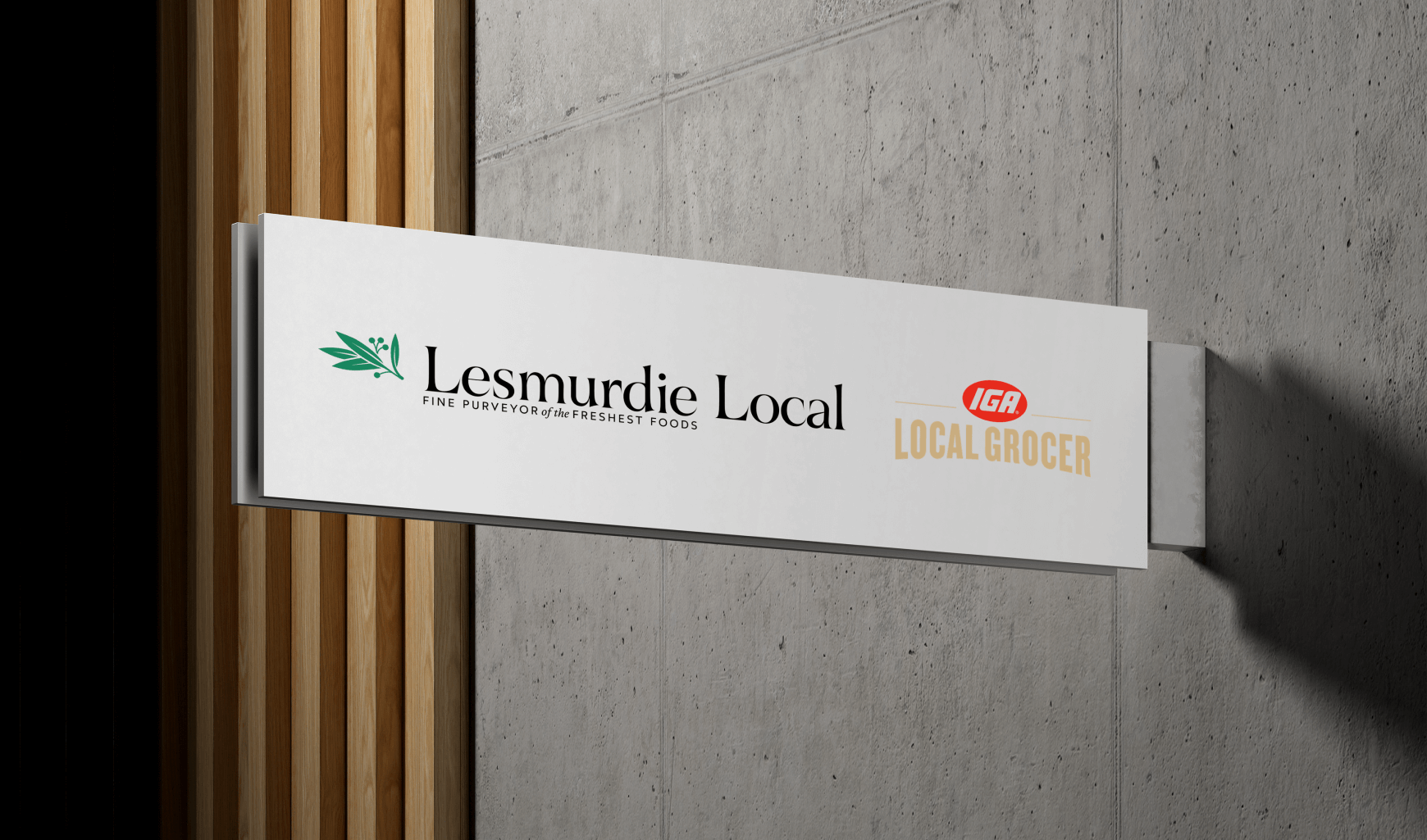
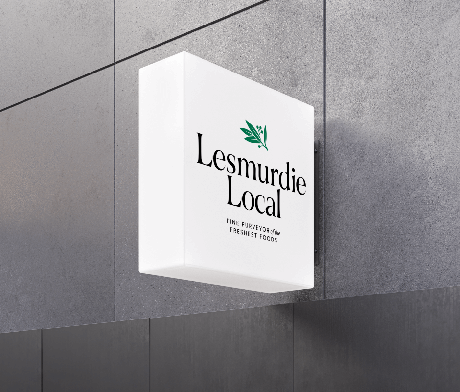
OKMG was engaged by a local IGA owner to develop a unique name and visual identity for their store under the IGA Local Grocer banner. The project began with a naming exploration that focused on the attractions and values of the surrounding suburb, ensuring the name conveyed a sense of community. “Lesmurdie Local” emerged as the strongest, most memorable option.
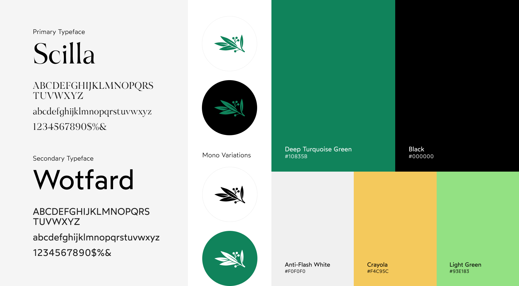
The brand identity project explored various concepts, resulting in custom iconography reflecting the local flora and fauna. The gum leaf design was chosen for its simplicity and recognisability, paired with modern sans serif typography. This branding is being rolled out across print and digital applications, setting the stage for a bright future and reinforcing the store’s commitment to fresh food and exceptional customer service within the community.


.svg)
.svg)
.svg)